The store receives a lot of traffic, and you market to the right audience. The brand is actively promoted on social media and succeeds in SEO, so the marketing efforts appear to be working.
But what if it doesn’t lead to many sales? That’s when you should examine if there’s something wrong with your conversion rates (CRs).
The conversion rate is an indicator of how many users take the desired action, such as:
- signing up for your newsletters;
- adding items to shopping carts;
- completing the order.
If half of your visitors leave without converting, it means they didn’t find what they were looking for somewhere along the customer journey. So dealing with the conversion rate may encompass more than just your product.It requires a flawless customer experience, removing all barriers in the navigation, and optimizing Magento performance. What are the typical conversion killers of Magento stores? Read this post to find what Magento store owners can do to skyrocket conversions.
What Can Destroy the Conversion Rate of Your Magento Store?
1. You Don’t Optimize the Store’s Performance
Before customers know what you offer, how wonderful your products are, and how your customer service works, they click on the link leading to the store. And how fast the website appears before their eyes may determine their readiness to buy.
If it’s slow, you can forget about conversions. With each second of waiting, the chances of conversion fall by 4.42%.
Why do conversions change depending on the site speed? It happens because customers hate even the thought of waiting.
You may spend hours creating the most attractive UX/UI design, but few people will appreciate it if they see a blank screen for more than five seconds.
That’s why the first Magento mistake to fix is the website load speed. Here are five tips to make your Magento store run more quickly:
- work on image optimization, such as choosing the right media size and weight, dimensions, and compression;
- use Lazy Image Loading, i.e., images will take up bandwidth only when needed;
- delete unnecessary data and logs;
- minimize the number of plugins;
- install caching software like Varnish.
Expert Advice on Magento Optimization
Magento store owners should pay attention to the mobile versions of their stores, as the role of mCommerce is growing every year. For example, mobile devices accounted for 58% of all Google searches in 2019.
How can you make the mobile shopping experience smooth? You may either develop a native app or optimize the store’s mobile version. And one of the options is to use cutting-edge solutions like progressive web applications or headless commerce. If you decide to make your website a PWA, you can utilize the Magento 2 PWA Studio or a different toolkit like Vue Storefront.
Optimizing the Magento store to be a PWA upgrades the site to a whole new level, such as:
- providing consumers with incredible UX/UI;
- speeding up the site on various devices;
- making the store mobile-friendly.
For example, below are a couple of mobile screenshots from the Bright Star Kids store built on Magento. It’s a quick and intuitive PWA that runs in the browser.
You can find the “Add to Home Screen” button in the settings and add the site shortcut to the phone’s home screen. It will look like an app icon, which is also accompanied by the native app-like experience of the PWA.
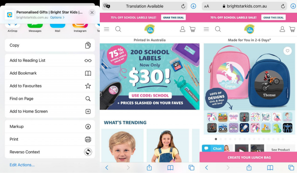
Screenshots taken on the official Bright Star Kids website
2. The Store Has an Inefficient Search
Another reason you can’t reach your goals of a high Magento store’s conversion rate deals with having poor search functionality.
Try to remember the last time you were in a brick-and-mortar store. Have you ever spent a bunch of time roaming the aisles looking for something? Did it cause frustration and disappointment?
The same applies when you want to buy something online. The more time it takes to search for a product, the more lost conversions, unsatisfied buyers, and abandoned carts you’ll have.
In terms of the search area, here are some things you can improve:
- make the search box visible and easily accessible from any part of the website;
- add hints within the search field so that your buyers have a clue about what to seek;
- use autocomplete, typo correction, and other enhanced search features;
- reorganize the fast search results to display the product’s preview photo, name, price, and any other details you believe are important to the user;
- consider adding voice search and image search.
Below is the Clean Origin online Magento store. When you open the website menu, you can see the search bar right at the top. Let’s type some phrases, such as “black diamond”. The store returns the results with the keyword phrase and allows you to choose from the related search terms. Plus, the products shown in the preview are fitted with all the main details and photos.
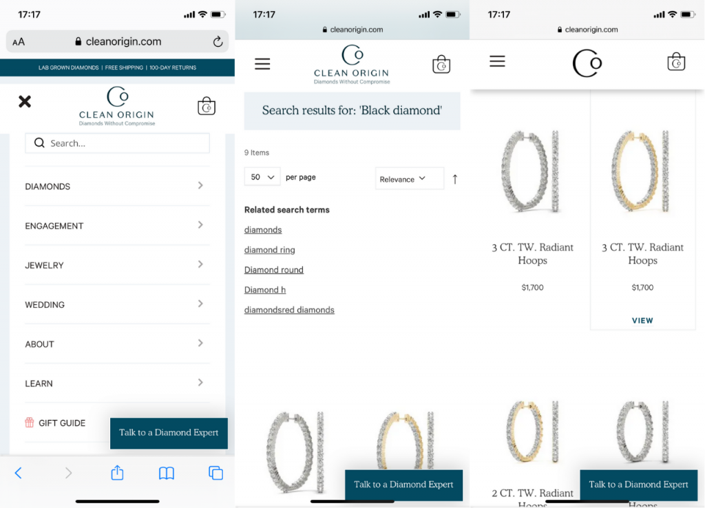
Screenshots taken on the official Clean Origin website
3. Complicated Checkout
So, your shoppers found the needed product and decided to buy it. But what stopped them?
Again, let’s fall back on the brick-and-mortar store example. Have you been in situations when you filled your cart and wanted to pay for the goods as soon as possible, but a huge queue to the checkout let you know it wasn’t that simple? Such inconvenience can urge you to leave the store. It works the same way with online shopping.
Here are the most common reasons for cart abandonment in Magento stores:
- Pricing that isn’t clear and includes many hidden fees that only become apparent when you try to buy the thing.
- The inability to purchase without first registering on the website.
- The checkout process is far too long and complicated.
How can you resolve the cart abandonment issue? I have a few suggestions on how to make the checkout process optimal:
- Reveal any additional costs, including shipping, delivery, and tax add-ons. Consider laying out the price components right on the first stage of the checkout process in the order summary area. It helps to avoid unneeded questions, calculations, and frustration.
- Allow a one-step checkout layout. The ability to buy in one step ensures that the customer won’t have to go through multiple time-consuming procedures to finish the purchase.
- Activate the Guest Checkout feature in your Magento store. Another option is enabling Social Login to register as a Facebook or Google user.
Why do some customers refuse to sign up and provide their contact information? The reason may be because they don’t want to receive emails or they don’t trust you yet.
If you remove this stage and allow purchasing without prior registration, more clients will complete the order. Do you see how the Graze store presents several checkout variants? If you’re in a hurry, you can skip registration, and that’s fine.
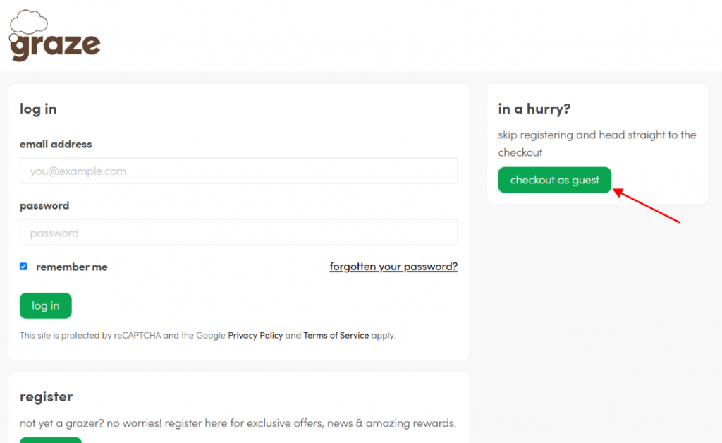
Screenshot taken on the official Graze website
To Sum Up
What factors can affect the conversion rate of a Magento store? A lot may go wrong, and even the most popular website should look into ways to reduce the page load time, boost the search area, and simplify the checkout.
Magento stores can serve thousands of clients since they are very customizable and scalable, for instance, thanks to the choice of extensions. So why not maximize the value of these visitors by following the strategies above?
About the Author
Alex Husar, chief technology officer at Onilab with 8+ years of experience in developing PWAs, Magento migration, and Salesforce development. He graduated from the Czech Technical University and obtained a bachelor’s degree in Computer Software Engineering. Alex’s expertise includes both full-stack dev skills and a strong ability to provide project-critical guidance to the whole team.


